About halfway through the process of creating the interior art, I’ll start thinking about the cover design for the book. The cover is one of the most important pieces because it is the first thing readers will see. And whether you like it or not, readers often judge a book by its cover!
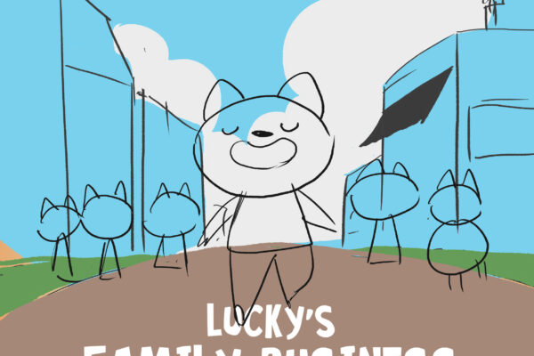
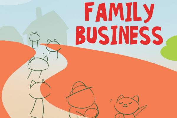
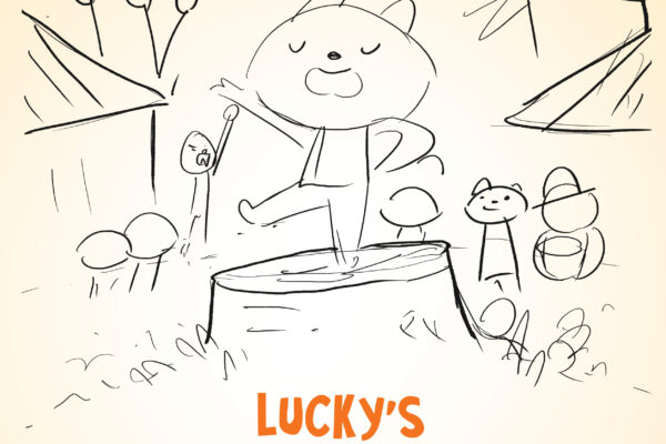
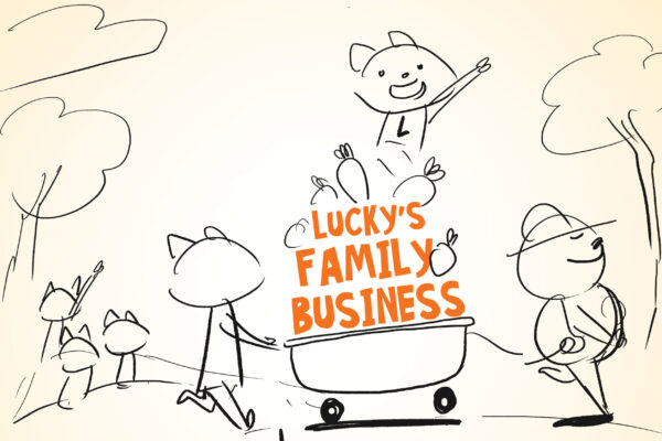
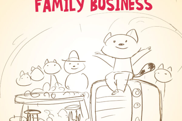
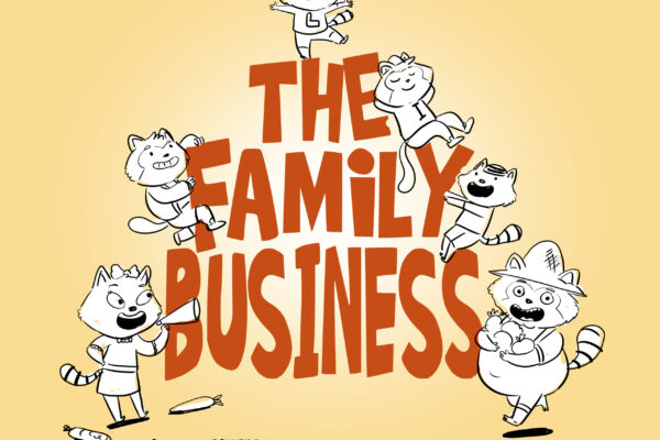
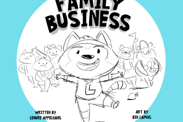
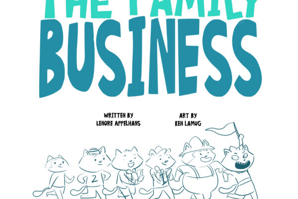
You already know what the final cover looks like, so I’ll be showing you the cover designs that were not approved. Who declines the cover design you ask? It’s often a bunch of people from the publisher… editors, art directors, internal staff, and sometimes even the sales team. As the artist, you might not exactly know who they all are but you’ll get a general consensus of what the “team” likes and what they didn’t like.
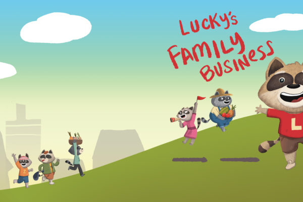
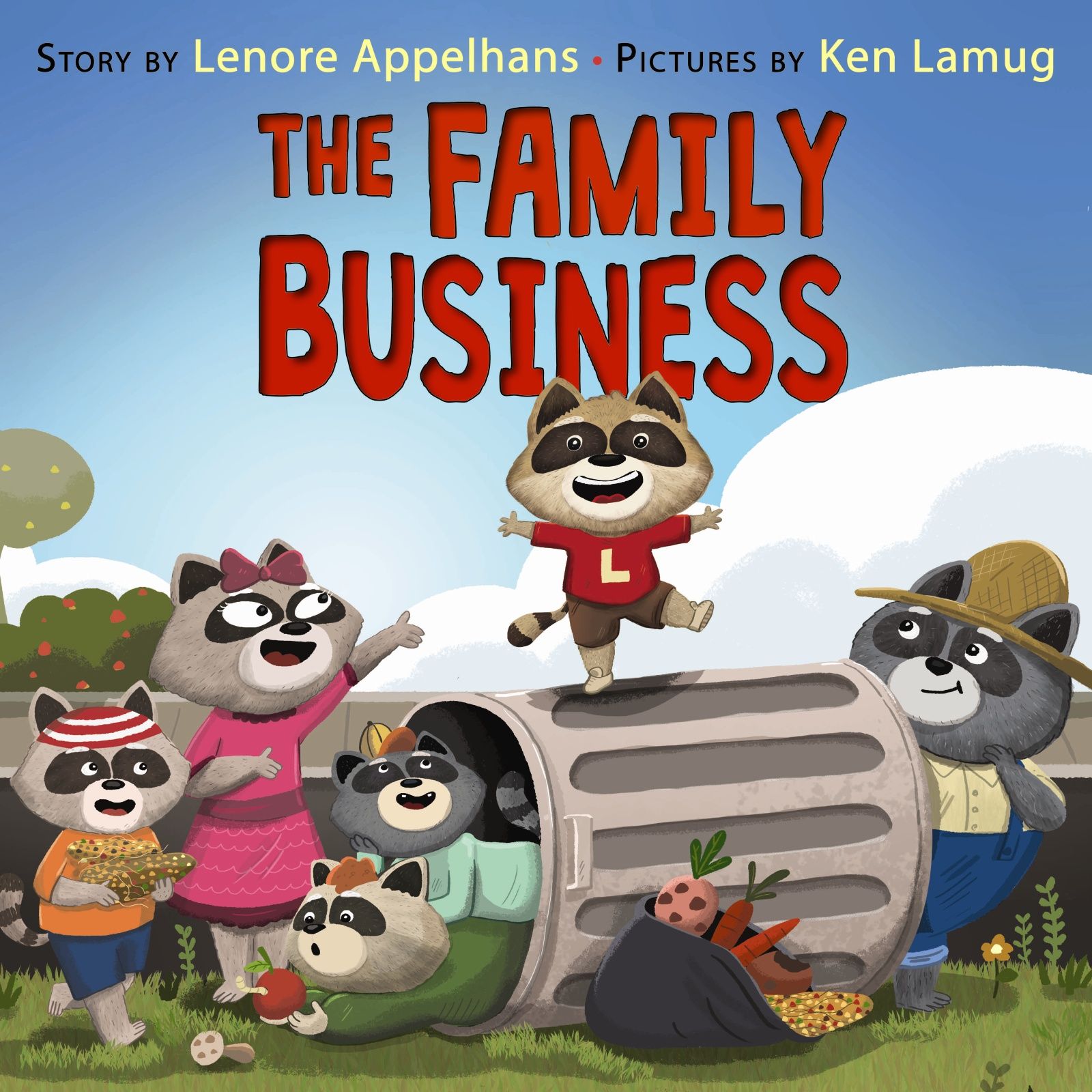
So let’s look at the final cover:
I love creating covers and if I could make a living just making cover designs, I think I’d take that in a heartbeat!
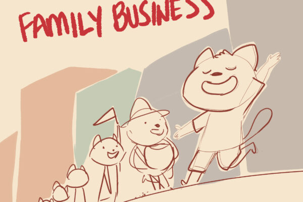
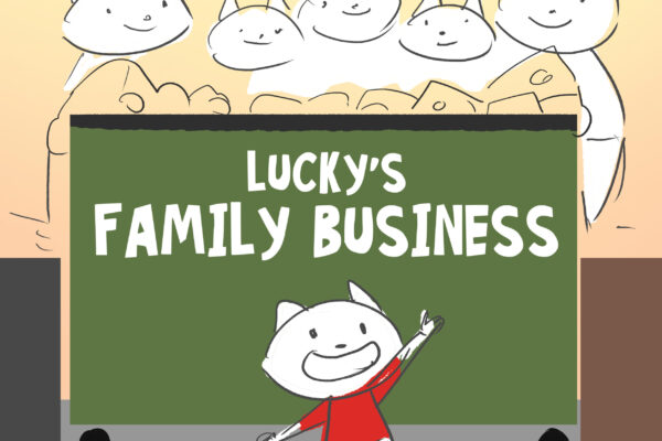
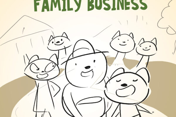
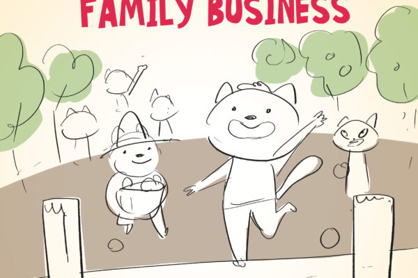
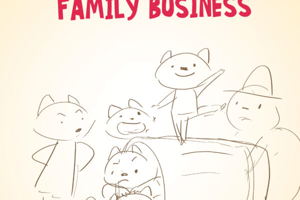
My cover designs (just like my interior art) will start with a sketch, a rough concept design where I don’t have to invest a lot of time and effort. I want to get an idea of what the team likes. Once I know, I will start coming up with more drawings based on their comments.
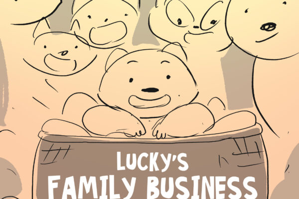
Some of the noticeable differences in these concepts include:
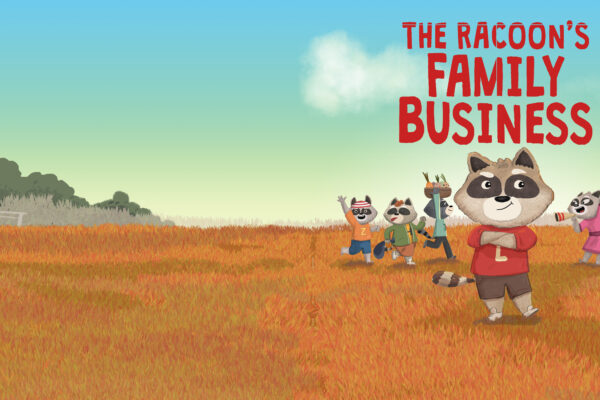
- Varying focus points where Lucky is located. Sometimes he’s in the center of the page, sometimes he’s leading the characters to the right (where our eyes naturally flow as western readers).
- The location/background also changes (trash bin, street, farm, pasture, fruit basket).
- Lucky, being the main character has a distinct pose and wave that calls out to the reader’s attention.
- The supporting characters are often smaller or in the background.
The last design at the bottom actually made it as an inside title page which is pretty neat. So not all is lost!
Which alternate page do you like best and why?
SUPPORT THIS BOOK!
Creating books is hard work that takes years and lots of effort. from many people Please show your support by buying the book and leaving us a positive review/feedback.

