After months of printer issues, I’ve finally gotten around to replacing the printer heads (easily cost $60 a pop for HP B8890 — seriously HP?).
Come to think of it, I’ve barely used this printer but I ended up having to replace 3 print-heads due to varying degrees of printing issues. Sometimes I wonder if it’s actually cheaper to simply send off your images to a print shop instead of spending $600 on a printer + inks and paper, not to mention the headaches of getting the prints to look like how you envisioned them on your screen.
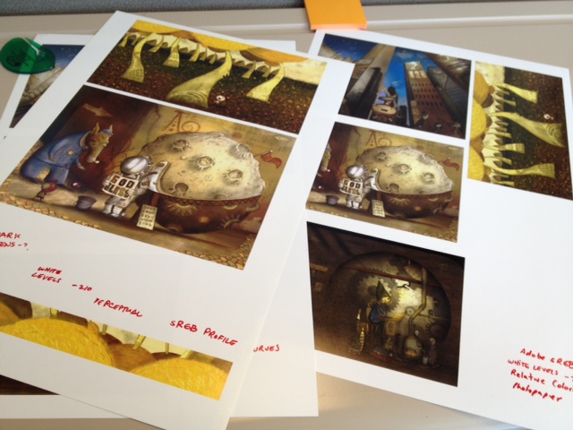
Now that it’s back and running I was able to make several test prints of some recent illustrations. I’ve always had issues with color level shifting and it probably doesn’t help that lighting at home is crappy — i.e., dark and amber.
I took the images with me to work today to view under good lighting conditions and they look pretty good. I can see that I have to tweak either my printer settings or my images because the reds and greens seem to disappear and the image tend to look quite yellowish. Even the blue on my little police mule doesn’t pop as much as it does on the computer screen. I guess that’s what you get for not color calibrating. As you will see I’ve made notes on the paper on the different print settings I’ve tried to see which one looks the best.
For me, it’s simply nice to have a tactile object of a piece of work you’ve been staring at for weeks on the screen. It’s a nice thing.
")
")
")
")
Printer: HP B8890, Archival Pigment Ink
Paper: Luster 13×19
I think it all looks beyond fantastic and I can’t wait to get my hands on the book! Also, if you ever decide to sell one of your original pics, count me in. I just LOVE your stuff.