Today, I’ve decided to color one of the “panels” for “The Last One.”
I actually just finished this illustration last night and it seemed like a good one to practice on, since I haven’t colored in a long time.
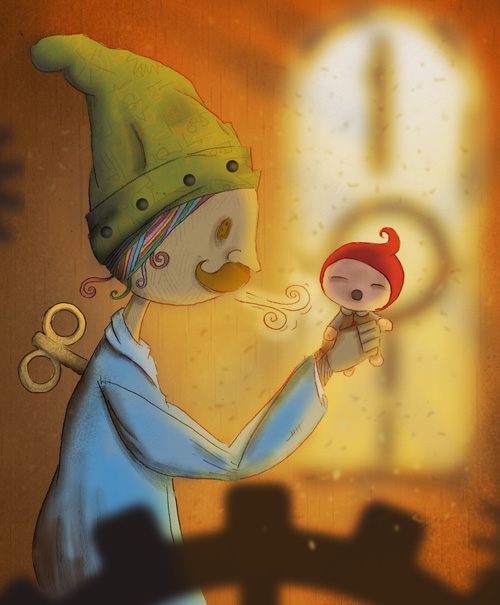
The original image fits in an 8.5×11 paper. I drew this using pencil (HB and 2B mostly). For this project, I will not be inking any of the hard lines.
This is the part of the story when the String Man just finished creating his last doll… and he breathes life into it. Let’s get to it…
1. As you can see below, I’ve already penciled in some of the shadows. Some cross-hatching was also added to the String Man’s face for texture. I started doing a pattern for the background, but decided against it later on.
The image was scanned at 600dpi and downsized to 300dpi for coloring in photoshop. I do have several photoshop brushes but only a few of those are really utilized. Having a lot of brushes seems to slow down the program considerably.

2. After removing the non-repro blue (actually you can still see the line since I didn’t do a very good job), I set the main line drawing layer property to “multiply”. This means everything I draw behind it will be see thru. This is a pretty standard technique for people who scan and color their images digitally.
The next step is to color in the base colors. Each of the main elements are colored in their own layers (i.e, String Man, Doll, Hair,Mustache). The background color is also on a different layer. It’s so much easier to do this if you have a tablet for your computer (instead of the mouse).

3. There’s a few things that happened in the layer below. First, a simple color gradient was added as the window. This will be the light source.
Then a circular gradient layer is added to replace the background. The middle color is light brown which gets darker as it reaches the edge. This creates focus to the center of the image.Using a brush pattern, I added a subtle vertical streak pattern on the edge (top and bottom).
The shadow areas for each character was also darkened a bit more for emphasis. (You will notice a combination of a regular brush as well as a textured distressed brush).

4. Using an overlay layer above all the other layers, a purty sunlight was added. I set this at about 80% so it won’t be too bright.

5. The window frames are added digitally…

6. Here, I added some of the elements I missed in the initial coloring such as the colored hair, as well as patterns on the hat.

7. On the hat, missing dots were added. I totally forgot to do this in the original sketch that’s why it’s being added now. A semi-transparent white glow was added to the breathe effect.
You will notice that the background also has a wood pattern, which was cloned several times to create a “staggered” feel. This is a color wood pattern which was turned into b/w, the opacity is set to about 10%…

8. For the final touches, light breaks were added by deleting some of the color in an outward pattern. Also random dust specs were added and blurred for the final image!

What do you think? Post below!
O-M-G. This is totally awesome. Would you come to dinner with me?
I love the vibrant colors!